
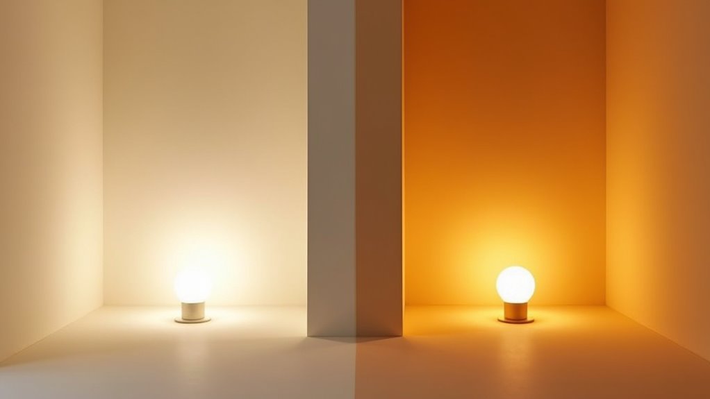
Soft white (~2700K) casts a pronounced amber-yellow wash, softening edges and lowering contrast for a cozy, restful feel. Warm white (~3000–3500K) shifts toward neutral white, preserving detail, color fidelity, and spatial clarity while retaining warmth. Both affect skin tones, texture perception, and circadian cues; CRI and fixture spectral control further determine accuracy. Choose soft white for relaxation and warm white for living spaces or tasks. Continue to uncover practical selection and placement guidance.
Key Takeaways
- Soft white (~2700K) produces a stronger amber-yellow tone that feels cozier and reduces edge definition.
- Warm white (3000–3500K) appears slightly whiter, preserving more detail and truer warm hues.
- Soft white prioritizes mood and relaxation, ideal for bedrooms and late-night ambient lighting.
- Warm white balances comfort with visual clarity, better for living areas, dining, and service zones.
- Check CRI (≥90 for color-critical tasks) because temperature alone doesn’t guarantee accurate color rendering.
Understanding Color Temperature: Soft White Vs Warm White
Color temperature, measured in Kelvin, quantifies a light source’s perceived warmth or coolness: lower values (around 2700K) yield yellowish, cozy tones often labeled soft white, while higher values (up to 3500K) produce a slightly whiter, more neutral appearance commonly called warm white; because labeling varies by manufacturer, relying on Kelvin values rather than marketing terms gives the most precise specification. The Kelvin scale ties to heated-body emission, so 2700K–3000K reads as softer, yellow-tinged light, whereas 3000K–3500K shifts toward neutral whiteness. Manufacturers interchange labels, causing inconsistency. For practical selection, specifying a Kelvin target ensures predictable color perception across fixtures. Advances in lighting technology permit tight spectral control, making Kelvin-based specification the reliable method for consistent results. Many users also consider energy efficiency when choosing between bulb types. Additionally, selecting the right color temperature can improve comfort and productivity by matching lighting to task needs and circadian preferences lighting effects.
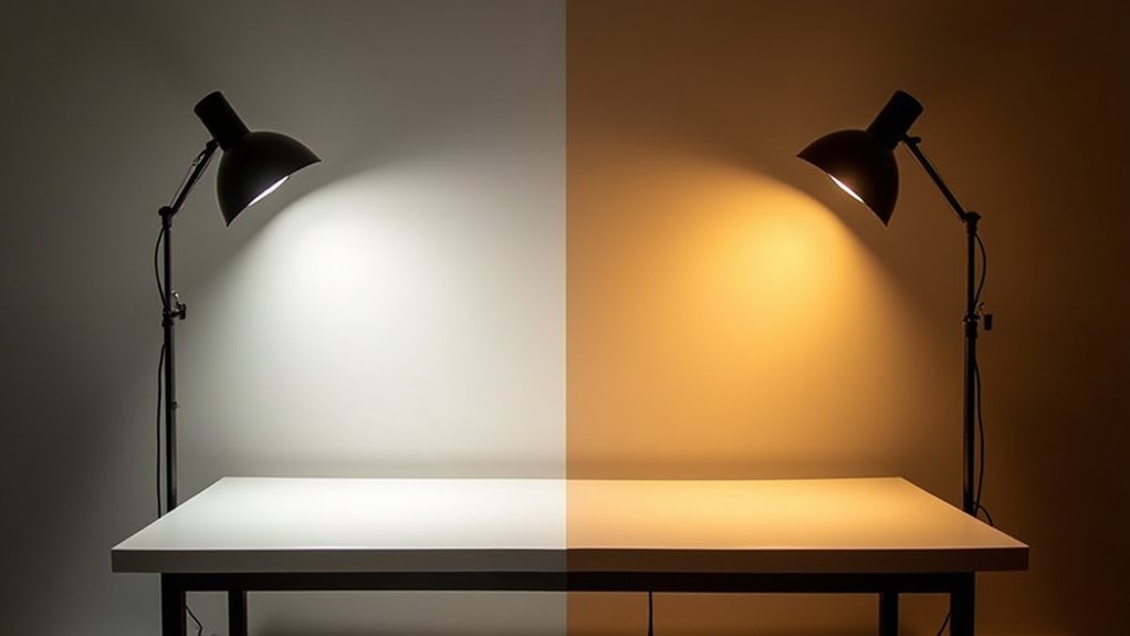
Visual Differences and How Each Affects Room Appearance
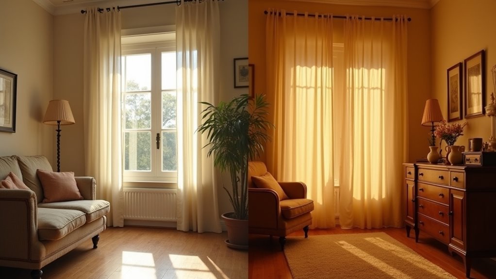
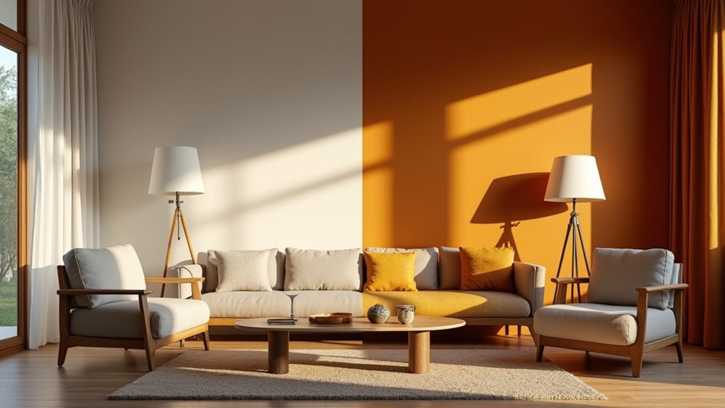
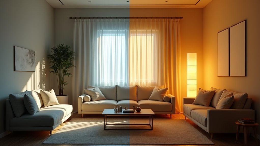
When viewed side by side, soft white and warm white diverge in hue and spatial effect: soft white casts a pronounced amber-yellow wash that mutes contrast and texture, producing a more intimate, cocooning atmosphere.
Whereas warm white shifts toward a neutral yellow-white that preserves detail, increases perceived brightness, and renders materials and finishes with truer, warmer tones.
Whereas warm white leans neutral-yellow, preserving detail, boosting perceived brightness, and rendering materials with truer, warmer tones
Contrast analysis shows soft white reduces edge definition and color saturation, softening surfaces and diminishing perceived room size; ambient effects favor relaxation and privacy.
Warm white improves color rendering and microtexture visibility, yielding sharper details and a slightly expanded spatial impression while maintaining warmth.
Practically, soft white prioritizes mood and enclosure; warm white balances comfort with functional clarity.
Best Uses: Where to Choose Soft White or Warm White
Although both ranges produce warm tones, choosing soft white (2700–3000K) or warm white (3000–3500K) depends on the intended balance between atmosphere and visual acuity: soft white prioritizes low-contrast, amber-rich ambiance for bedrooms, late-night living areas, and decorative accents, while warm white offers higher perceived brightness, truer color rendering, and finer microtexture visibility suited to living/dining rooms, entryways, commercial lobbies, and moderate task zones.
- Bedrooms & late-night ambient settings: specify soft white for restful, vintage-style residential applications and decorative accent layers.
- Living/dining & entryways: select warm white to enhance skin tones, food presentation, and surface detail.
- Corridors, lounges, guest rooms: use soft white where relaxation is primary.
- Service zones, pantries, under-cabinet task strips: use warm white for clearer color and moderate precision.
Psychological Effects and Mood Considerations
Because spectral warmth directly influences autonomic and cognitive responses, lighting choices produce measurable shifts in mood, social behavior, and circadian physiology.
Warm white (2700–3000K) elicits relaxation, comfort, and perceived safety, supporting mood enhancement, social bonding, and evening melatonin onset.
Warm white (2700–3000K) promotes relaxation, comfort, and perceived safety, aiding mood, connection, and evening melatonin onset
Cool white (4000–6500K) increases alertness, clarity, and vigor, useful for daytime productivity yet potentially reducing intimacy.
Psychological outcomes depend on intensity, timing, and context: excessive warm exposure may overstimulate sensitive individuals, while prolonged cool exposure can cause fatigue or discomfort.
Optimal strategies balance temperatures across the day, matching lighting preference to functional needs—warm for leisure and social settings, cool for tasks and clinical contexts.
Interior colors and ambient layering modulate these effects, so integrated design refines emotional responses.
Color Rendering, Task Suitability, and Practical Tips
How does color rendering influence task performance and visual comfort?
Color rendering affects perceived hue fidelity and contrast, altering accuracy and eye strain. Soft white often reaches CRI 80–95, yielding rich, relaxed tones but reduced sharpness for detail work.
Warm white (CRI 80–90) balances comfort and clarity, better for tasks needing moderate color fidelity. Practical guidance focuses on CRI and placement.
- For ambient relaxation choose soft white (2700–3000K) with CRI ≥80; prioritize mood over precision.
- For kitchens, reading, and prep tasks choose warm white (3000–3500K) with CRI ≥80 for improved task suitability.
- For color-critical work select CRI ≥90 regardless of temperature.
- Always verify CRI on packaging and match fixture intent.
Articles on the same topic:
-

Wiring 3 Pendants to One Junction Box: DIY Guide
-

Calculating Lumens for High Vaulted Ceilings
-

PILLAR: Ultimate Guide to Kitchen & Dining Lighting
-

When Were Chandeliers Invented? A Deep History of Luxury Lighting
-

How to Take LED Lights Off the Wall Without Damaging Your Walls
-

What Size Pendant Light for Living Room? Dimensions Height Guide