The 60-30-10 decorating rule is a simple way to balance colors in any room:
- 60% = dominant color (walls, floors)
- 30% = secondary color (furniture, textiles)
- 10% = accent color (decor, accessories)
This method helps create a visually balanced space without guesswork, even if you’re not a professional designer.
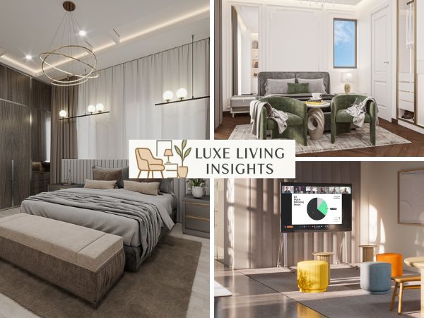
Balance your home using the 60 30 10 decorating rule. This guide explores structuring dominant colors, selecting secondary furniture, and placing accent decor to achieve professional visual harmony.
Understanding the 60 30 10 Decorating Rule for Balanced Interiors
Interior design often feels like a mystery, but the 60 30 10 decorating rule acts as a color proportion formula that simplifies the process. This timeless decorating rule ensures your space feels organized rather than chaotic. The rule organizes colors by dividing a room into three distinct weight classes.
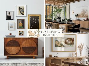
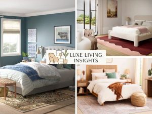
At its core, the 60% main color serves as the dominant hue. This main color anchors the space and serves as a backdrop for everything else. Usually, walls represent the dominant proportion, while a large area rug or neutral flooring provides the foundation.
Because this color occupies the most visual weight, designers often choose a soothing neutral greige or soft white. This dominant color defines the room atmosphere, ensuring the neutral palette creates a calming environment.
The 30% secondary color provides the necessary contrast to prevent the room from looking flat. This secondary color supports the main color but is different enough to set them apart. While the 60% is the canvas, the 30% is the character. Textiles feature the secondary shade, and upholstery often takes the lead here.
By using secondary furniture like accent chairs or stunning oak furniture coffee tables, you prevent the dominant color from becoming monotonous.
Finally, the 10% accent color adds the pizzazz. This accent color provides contrast and adds a pop of color or drama. Think of it as the jewelry of the room.
Accessories function as accent pieces, and this accent tint is where you can be bold. Whether it is navy blue or a vibrant sunset orange, the 10% proportion refers to the accent color that ties the visual story together.
Example:
In a modern living room:
- 60%: white walls and light wood flooring
- 30%: a gray sofa and curtains
- 10%: blue cushions, artwork, and small decor items
This creates a clean, balanced look without feeling boring.
Selecting Your Primary Furniture Pieces as the Secondary Color (30%)
When applying the golden ratio to furniture, the 30% proportion refers to the secondary color in the room. This is the most strategic part of space planning. You must identify secondary furniture that breaks up the dominant surface of the walls and floor.
| Furniture Type | Role in the Ratio | Proportion |
|---|---|---|
| Sectional Sofa | Main/Dominant Color | 60% |
| Accent Chairs | Secondary Color | 30% |
| Painted Furniture | Secondary Color | 30% |
| Throw Pillows | Accent Color | 10% |
Furniture occupies the secondary proportion when you choose pieces like upholstery or bed linens in a shade that complements the walls. For instance, if you have 60% white walls, your 30% secondary color might be a rich wood tone flooring or stunning brownstone furniture dining tables. This secondary color provides contrast and gives the room interest.
Draperies complement secondary colors beautifully. When your curtains match your accent chairs or stunning four hands furniture dining tables, you create a cohesive secondary coverage that flows throughout the room. This visual weight influences the room feel, making it feel grounded and intentional.
Strategizing Color Palettes Using the Color Wheel
To master the 60 30 10 decorating rule, you must understand how a color wheel guides palette selection. A designer selects a palette based on how colors interact.
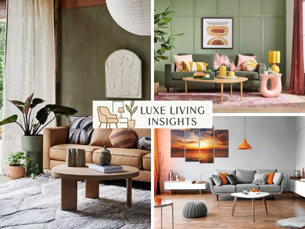
- Analogous Scheme: These neighboring colors sit next to each other. For example, blue, green, and yellow. A middle color like green often acts as the dominant color, while the others act as supporting colors.
- Complementary Scheme: These colors oppose each other. A complementary scheme creates high energy, such as hues of purple and yellow.
- Monochromatic Style: This utilizes a single color family. The main, secondary, and accent colors are simply varying shades of the same color. You might use a pale blue for 60%, a navy blue for 30%, and a true blue for 10%.
This color proportion formula ensures that even bold colors don’t feel overwhelming. Contrast enhances depth, and proportions ensure harmony. When the layout reflects the ratio, the space feels balanced.
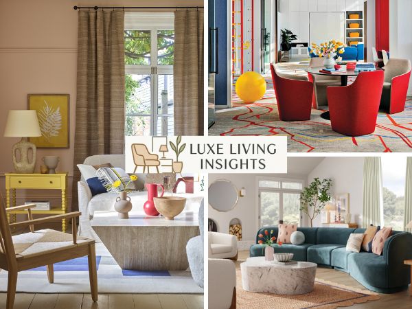
Integrating Decorative Accessories and Accents for the Final 10%
The final 10% accent color is where you add pizzazz to your space. While 90% of the room is set, these small accent pieces provide the visual interest.
Decor exhibits an accent tint through items like lamps, candles, and artwork. A designer pulls a color from artwork to use as the accent color elsewhere, such as in throw blankets or vases. Even lighting highlights accent colors, making lamps and candles essential for this 10%.
This accent color provides a pop that keeps the room from feeling too bland. You can ground these smaller details by choosing high-quality home furniture coffee tables as a center point.
Adapting and Customizing the Ratio for Unique Spaces
A decorating rebel might find the 60 30 10 decorating rule too restrictive. However, the formula prevents chaos even when customized. One popular variation is adding another 10 to the equation.
This design scheme with 110% color actually just splits the percentages. You might have 60% main color, 30% secondary, and two 10% accent colors. This rule variation allows 110% proportions by removing a bit from the dominant color. If the 30-30-20-20 formula feels better, you can experiment with those proportions. The goal is always to achieve balance in decorating.
Maintaining Long-Term Appeal with Color Trends and Neutrals
Choosing a neutral base for your 60% dominant color ensures neutral colors have a longer lifespan. You can then rotate popular color trends in the 10% accent color category. Major paint manufacturers often release a color of the year, which is perfect for small items like pillows or frames. This way, your interior space stays up-to-date without a full renovation.
Common mistakes to avoid:
- Using too many accent colors → makes the room feel chaotic
- Choosing colors with the same tone → lacks contrast
- Ignoring lighting → colors look different in natural vs artificial light
- Overusing bold colors in the 60% → overwhelming space
Frequently Asked Questions
What happens if I want to use a monochromatic color scheme with this rule?
In a monochromatic color scheme, you apply the 60-30-10 rule by using varying shades of the same color. The main color is typically a soothing neutral, the secondary color is a deeper shade, and the accent color is the palest shade or a middle tone from the same color family.
Can I use more than three colors in a room?
Yes. You can follow the 110% option by splitting the accent color into two. This involves using two 10% accent colors instead of one. This approach adds depth and allows for more visual interest while still maintaining the visual balance of the space.
Why does my room feel off-balance even if I use these percentages?
A room may feel off-balance if the visual weight of the colors is not distributed correctly. Ensure the dominant color is used on large surfaces like walls or area rugs, and the secondary color provides enough contrast. If the accent color is too sparse or too concentrated, the harmony may be disrupted.
Is the 60-30-10 rule a rigid law of design?
The 60-30-10 rule is a flexible framework and a guideline rather than a rigid law. It serves as a decorating tool to help you combine a color scheme easily. You are encouraged to experiment with proportions to find the balance that speaks to you.
Conclusion
Mastering the 60 30 10 decorating rule ensures your furniture and decor create visual harmony. Start with dominant walls, add secondary furniture, and finish with accent accessories. We invite you to share your designs or read more at luxelivinginsights luxelivinginsights.com. Your journey to a balanced home starts here!
Pro tips from interior designers:
- Start with a neutral base if you’re unsure
- Use textures (wood, fabric, metal) to add depth
- Repeat accent colors at least 2–3 times in the room
- Test colors in different lighting before committing